Ponte Vecchio
A homepage redesign for an Italian seafood restaurant themed around the bridge in Florence, bringing the site in line with the brand it was supposed to represent.
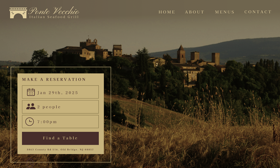
Atmosphere first. The feeling of the place lands before a single word.
Overview
Ponte Vecchio is an Italian seafood restaurant in Old Bridge, NJ, themed around the famous bridge in Florence.
Their site was a leftover template from an earlier era of restaurant web design, and it did not reflect the place at all. The restaurant is warm and upscale and built around a specific story, from the bridge to the décor to the imported feel of Tuscany. I redesigned the homepage around that.
The problem
The original site worked, technically. Hours listed, phone number there, menus linked as PDFs. It just did nothing to make you want to go.
- No visual identity. Plain text blocks and a small header logo, with nothing evoking the Florence theme the restaurant is built around.
- Reservations were a dead end. The only way to book a table was to call during business hours.
- No storytelling. The décor is modelled after a 700-year-old bridge, and the site never mentioned it. That hook sat buried under links to sister restaurants, DoorDash, and gift cards.
- Info was hard to scan. Service hours ran as a paragraph instead of something you could check on your phone in three seconds.
It read like a directory listing rather than a restaurant.
Process
Six changes, each tied to one of the problems above.
- Led with atmosphere, not text. A full-width photo of the Tuscan countryside opens the page, so the feeling of the place lands before anyone reads a word.
- Put reservations above the fold. A date, party size, and time widget sits directly on the hero image, turning "call during business hours" into something you can start on any device.
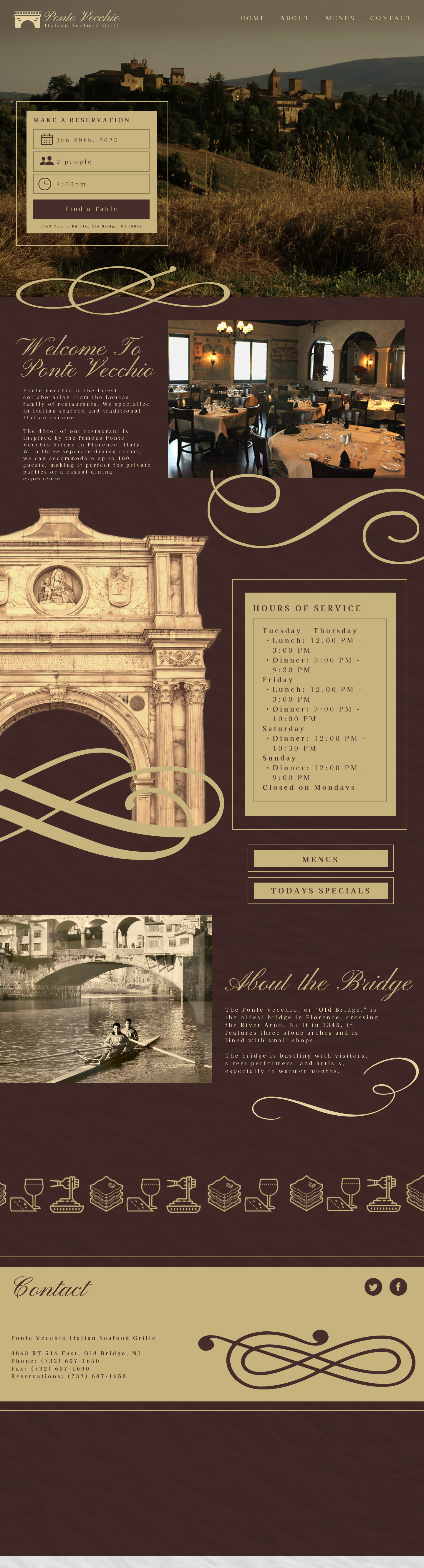
- Gave the bridge story a moment. An About the Bridge section with its own photo and a short warm story, because the most distinctive thing about the restaurant should not be a footnote.
- Cut the clutter. Navigation trimmed to Home, About, Menus, and Contact, with ordering and gift cards moved out of the main flow.
- Made the practical stuff scannable. Hours broken into a day-by-day block, since most people are checking whether it is open right now.
- One visual language throughout. Burgundy and gold, a flourish motif, and serif script headers over small-caps labels, carried through every section.
Final product
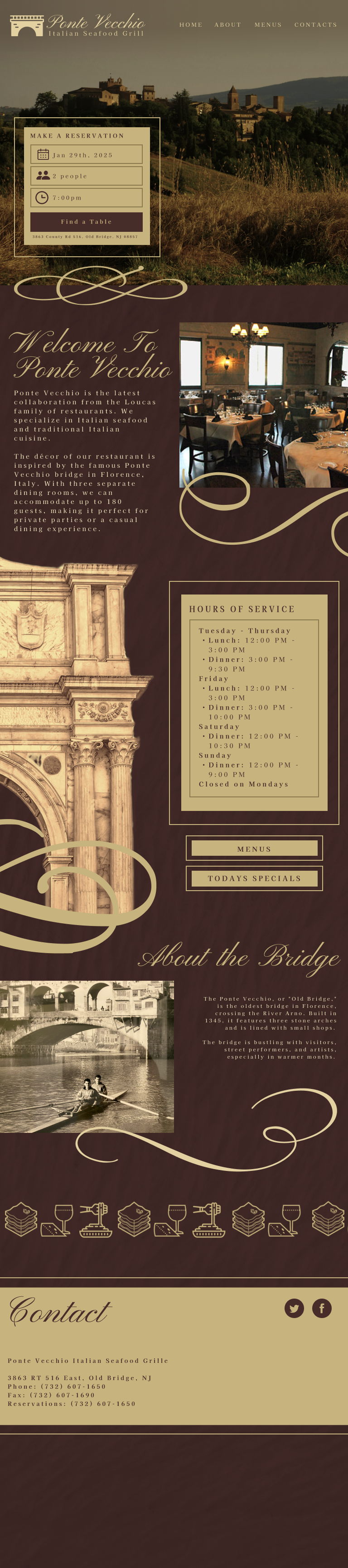

The same homepage at desktop, tablet, and mobile. Scroll inside a frame, or expand it.
Challenges
- Atmosphere against the fold. A full-width photo and a reservation widget want the same space. Letting the widget sit on the image rather than beside it meant neither had to give ground.
- Cutting links the business wants kept. Sister restaurants, DoorDash, and gift cards all have a reason to exist, so moving them out of the main flow beat deleting them.
- Warm without tipping into pastiche. Burgundy, gold, script headers, and a flourish motif go decorative fast. A disciplined layout underneath the ornament is what holds it.
Outcome
A homepage that represents the restaurant it is for: warm, story-driven, and built around booking a table rather than listing information.
The useful realisation was that the old site was not missing a feature. Everything a visitor needed was technically there. What it lacked was a reason to care, and fixing that came down to giving the restaurant's best story real space instead of a sentence.
What I'd explore next
- The interior pages, menus especially, which are still PDFs and are the second most visited thing on any restaurant site.
- A real reservation integration, since the widget is currently designed rather than wired.
- Photography direction, because the whole atmosphere-first approach depends on the images being good.