T.E.M. Studios
A new brand identity and a full website rebuild for a teen third-space program, starting with the people the whole organisation exists for.
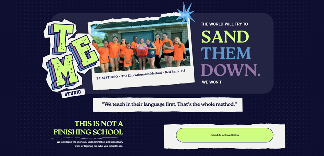
A brand that belongs to the teens it serves.
Overview
T.E.M. Studios is a teen third space. Somewhere to exist, create, and belong outside of home and school.
The organisation had outgrown its brand and its website. Both had been built piecemeal and no longer reflected who the program served or why it mattered. I was brought on as a contract designer to rebuild the identity, logo system, and guidelines from scratch, then design a new website around them, working directly with the client on a compressed timeline.
The problem
None of what I found was a polish problem.
- The brand did not reflect the community. Nothing tied the organisation together visually, and nothing felt like it belonged to the teens who spent time there.
- The site had grown without a plan. A cart that did nothing, a concluded fundraiser still listed as active, and donations scattered across several systems.
- Content was buried or duplicated. Hours, FAQs, and the org overview each had their own page while the homepage covered the same ground, and booking a program had no clear path at all.
- No space for the teens' work. A program built entirely around teen-made projects had nowhere to show them.
It was a strategy problem. The brand and the site needed rebuilding around a real point of view, not patching.
Process
Starting with the teens
Instead of guessing at what would land, I took the direction of the rebrand to the people it is for. I sat down with teens at the program and asked what T.E.M. Studios meant to them, and what felt designed for them versus at them.
Those conversations produced the concept the whole rebrand runs on: a hip-hop-themed identity. It gave the brand cultural specificity and ownership that a generic teen-program aesthetic never could, and it came out of listening rather than taste.
They also clarified the real failure. The old brand was not dated so much as institutional. It described the program the way a funder would, not the way someone who spends time there would.
Rebuilding the brand
The hard part was making "hip-hop-influenced" hold up across a full nonprofit site. It had to work on a poster and still read as trustworthy to a parent.
The system splits that across two layers. Expression lives in the display type and colour: heavy condensed headlines, used loud at the top of a page and nowhere else. Credibility lives in everything underneath, a plain legible body face, generous spacing, and a neutral base that lets the accent carry the volume. A teen reads the page as theirs in the first second, and a parent reads it as legitimate in the next five.
The website rebuild
I audited the existing site and used it to restructure the information architecture, rethinking what content needed to exist and where rather than restyling what was there.
- Consolidated the navigation. Scattered top-level pages folded into two hubs, a Ways to Give menu and an About TEM hub.
- Gave donations one home. Several inconsistent paths replaced by a single platform, Donor Box, with the Lupin Scholarship Fund as the primary campaign.
- Built a path to booking. A dedicated booking page linked from the homepage, plus booking tied to each individual program.
- Created space for teen work. A Student Project Showcase gives the program's actual output a permanent home.
- Cut dead weight. The broken cart and the finished fundraiser came out of the navigation entirely.
- Rebuilt the homepage as a front door. Real mission copy, a prominent booking call to action, and no duplication of content that belongs elsewhere.
Final product
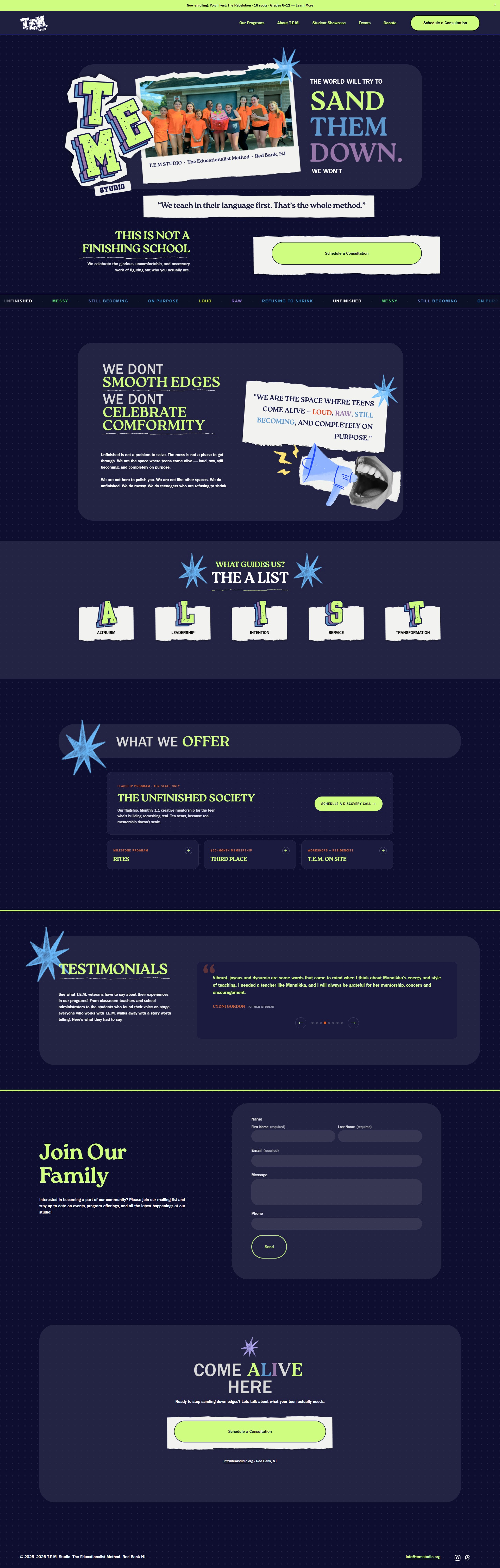
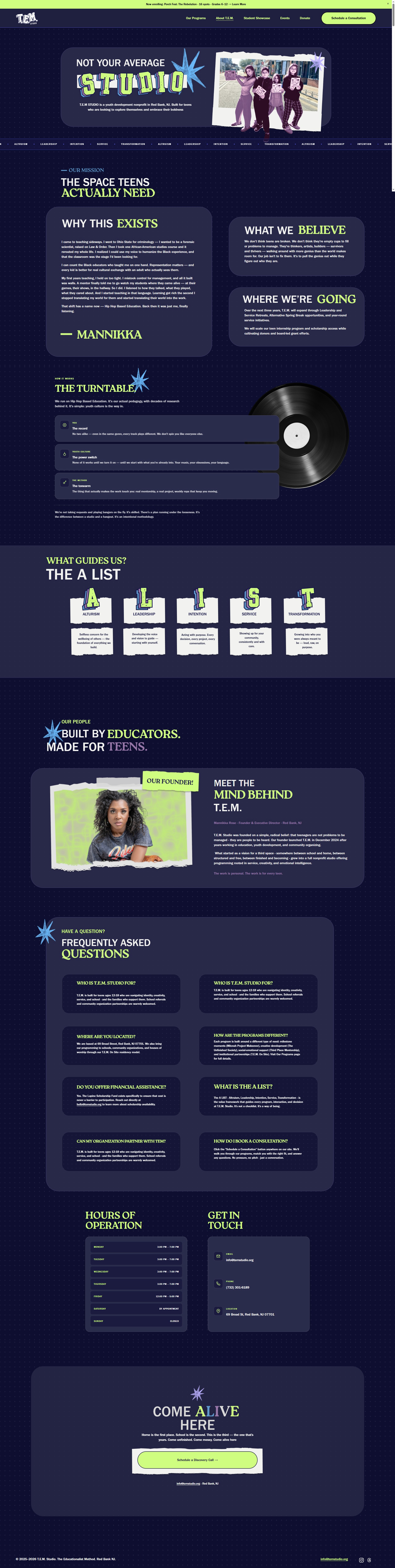
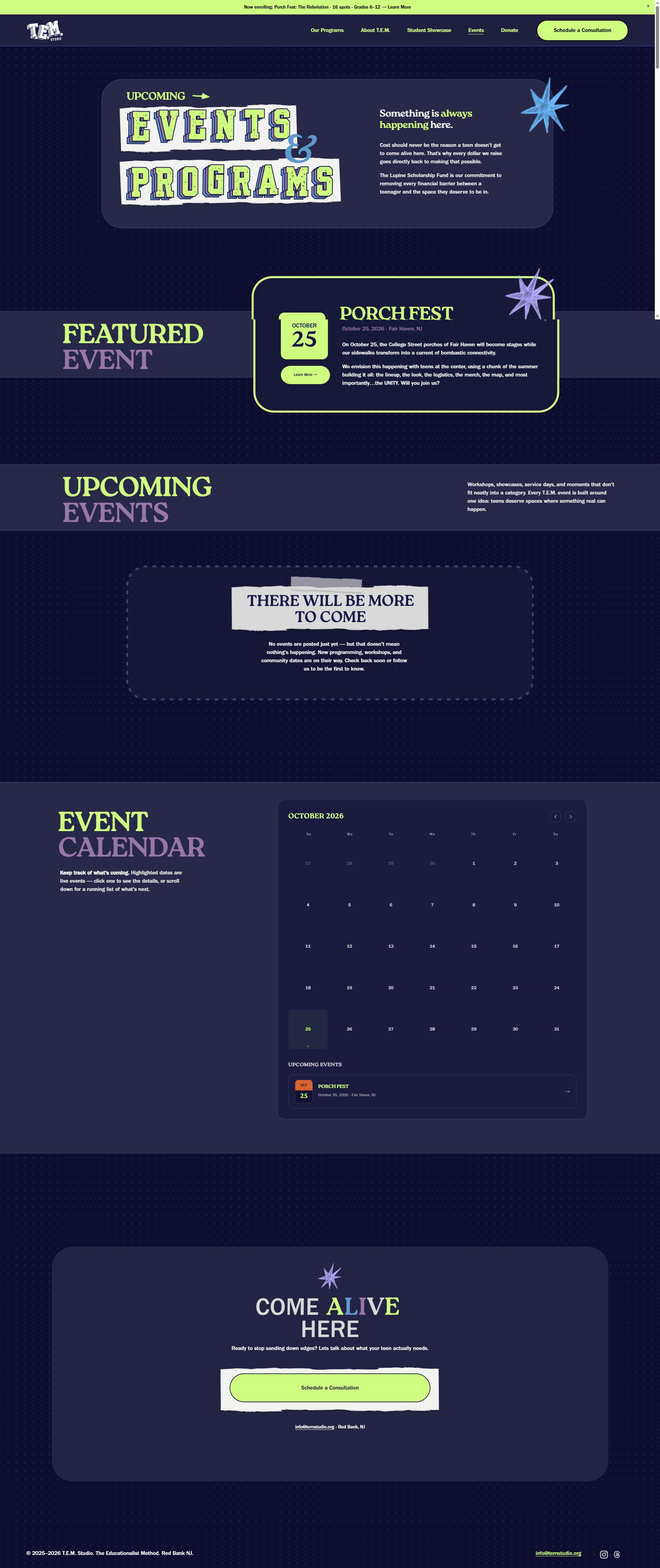
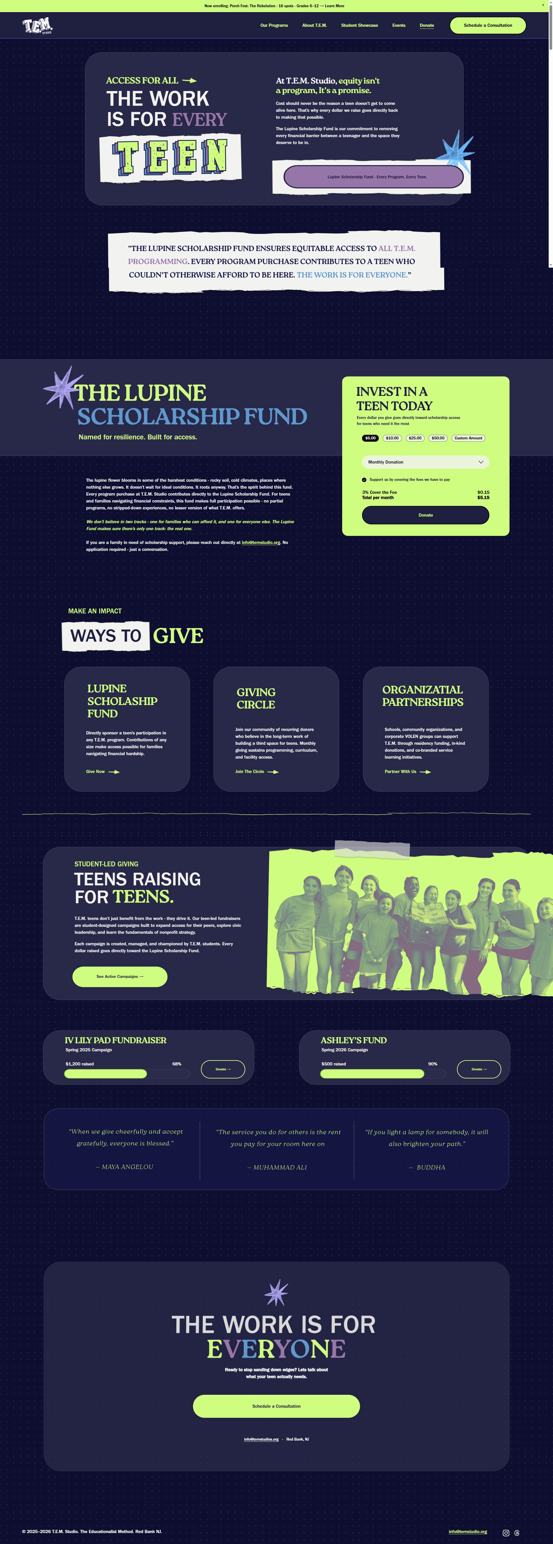
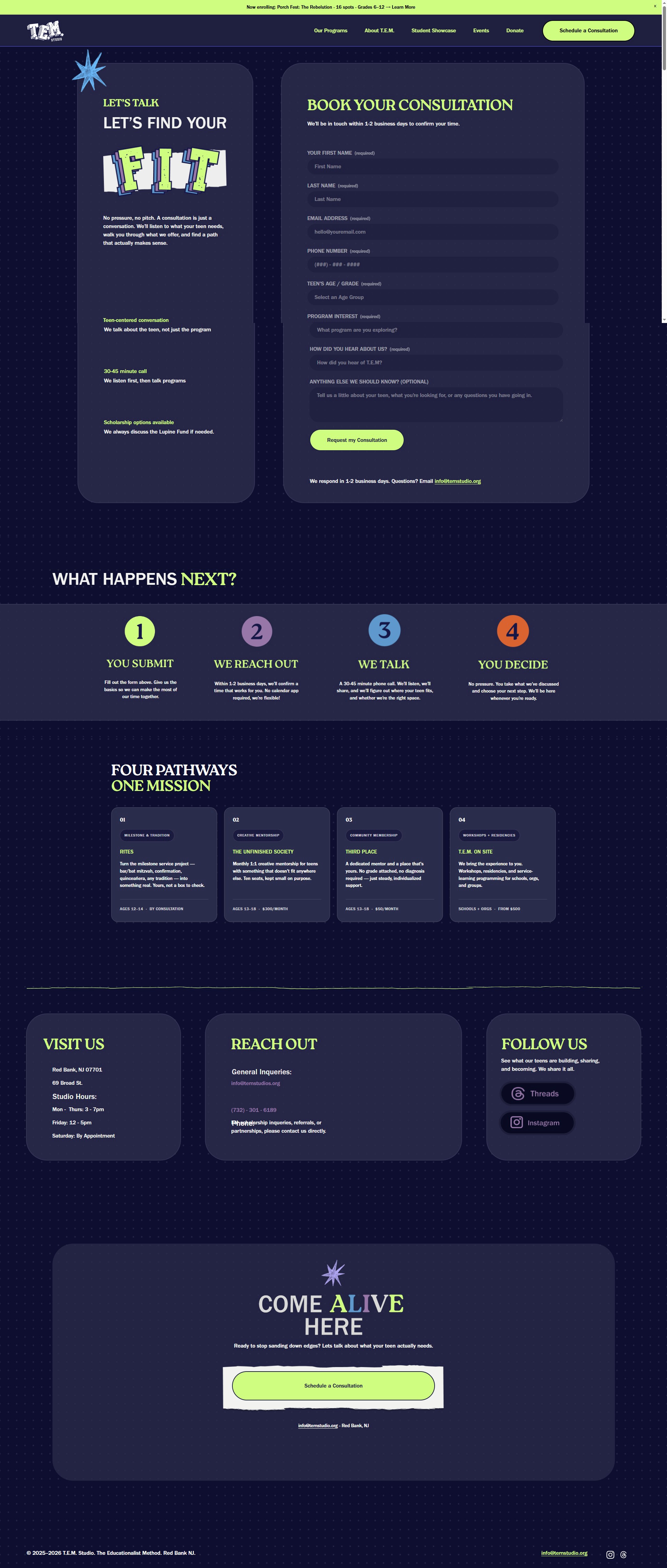
Scroll inside each frame, or expand it to full size.
Challenges
- Two audiences at once. The brand had to feel current to teens and credible to the parents and donors funding the program, which is a real tension with a direction this specific.
- Structure without budget. Every platform call had to weigh functionality against what a nonprofit can actually afford on a free tier.
- Earning buy-in. A hip-hop rebrand is a big swing for a nonprofit, so the direction had to be defended with reasoning from the teen sessions rather than presented as preference.
- A compressed timeline. Concept through launch, identity and site both, working solo with the client.
Outcome
The organisation ended up with a brand built on a real point of view, navigation that matches how people use the site, one clear donation path, a working booking flow where none existed, and a permanent home for the teens' own work.
What I keep coming back to is how much leverage the research had. Taking the direction to the teens first is what made a bold, culturally specific identity defensible in a room of adults. It stopped being a preference and became a finding.
What I'd explore next
- A lightweight brand toolkit so staff can make on-brand event material without a designer.
- Bringing teens into the Student Project Showcase as contributors rather than subjects.
- Measuring the booking flow, since it is new and its real conversion is worth knowing.