
Parker Homestead
Three kinds of design work in one role at a 360-year-old historic site: a website rebuild, a merchandise line funding preservation, and a working digital archive built from scratch.
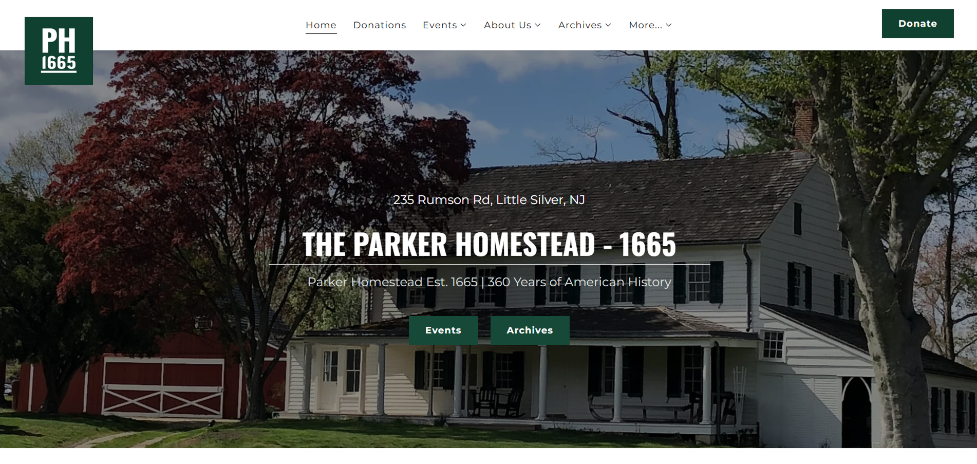
The rebuilt homepage. History first, without feeling dated.
Overview
The Parker Homestead is one of the oldest structures in New Jersey. A farmhouse and grounds dating to 1665, held by one family until 1996 and now run as a nonprofit historic site in partnership with the Borough of Little Silver.
As sole web designer I took on three pieces of their digital presence: a full website rebuild, a merchandise line to help fund preservation, and a working archive, coded in HTML and JavaScript, to bring the physical collection online.
Three different kinds of design thinking in one role. Brand-facing web design, product design, and something closer to a lightweight collections system.
The challenge
A preservation nonprofit has a design problem most brands do not. The site has to feel credible and historically grounded, not like a generic nonprofit template, while still working well for the people using it.
Those people are not one audience. A donor, a genealogy researcher, and a parent booking a school trip arrive with different goals and get routed through the same few pages.
- Credibility and usability pulling apart. Archival gravitas and a fast, phone-friendly site are not naturally the same design.
- Structure that mirrored the org, not the visitor. Content was grouped by how the nonprofit thinks about itself rather than by what someone came to do.
- A collection stuck offline. Genuinely researchable material existed only in boxes and binders, with no digital collections system of any kind.
- One funding stream. Preservation work needed income beyond direct donations.
Process
Website rebuild
The rebuilt site is organised around why people actually come: visiting, learning the history, donating, or researching the archive. An About hub holds the Homestead's history, restoration projects, and an interactive timeline, with a dedicated Archives section and direct paths to Donate, Volunteer, Events, and Educational Visits.
The homepage leads with a full-bleed photo of the homestead and a short mission statement, then a three-path support section: Volunteer, Donate, Shop. A first-time visitor can see every way to get involved without digging.
Visually it leans into the history rather than away from it. Deep historic tones and straightforward typography that reads as archival, held in a clean modern layout so it still works on a phone.
Merchandise line
I designed and launched a merchandise line sold through the site, giving the organisation a funding stream beyond donations. The designs pull from the Homestead itself, the farmhouse silhouette and the 1665 founding date, treated simply enough to print cleanly and to read as something a supporter would actually wear rather than a fundraising souvenir.
The merchandise line, funding preservation and educational programming.
The virtual archive
The most technically involved piece. A browsable catalogue of the physical collection of books, records, sheet music, and postcards, coded from scratch in HTML and JavaScript and hosted as its own space separate from the main site.
- Filtering by item type, so a researcher can narrow to what they came for.
- Four sort options, by title, date, author, and item ID, which is what gives it real research utility over a static image gallery.
- Grid and list views, for browsing visually or scanning quickly.
Because there was no existing collections system, I had to design the interface and the underlying structure for how each item gets catalogued. Deciding what a record is came before deciding what it looks like, and that is the only reason filtering and sorting work at all without a database behind them.
Building a real catalogue without a backend meant thinking through data structure as much as visual design.
Final product
Scroll inside the frame, or expand it to full size.
Challenges
- Gravitas versus usability. Every decision had to serve two masters: respectful of a 360-year-old site, and easy to navigate on a phone.
- An archive with no backend. Building filtering and sorting for a genuine catalogue in HTML and JavaScript was a data-structure problem more than a marketing-site problem.
- Many audiences, few pages. Donors, researchers, school groups, and casual visitors all needed different things from the same handful of pages.
Outcome
The redesigned site, the merchandise line, and the virtual archive are all live and in use. I held the Web Designer role from fall 2025 through summer 2026, managing updates and expanding the digital presence as the organisation's needs changed.
The archive is the piece I would point to. Designing the catalogue schema before the interface is what made the rest possible, and it is the closest I have come to designing a system rather than a set of pages.
What I'd explore next
- Full-text search across records, the obvious next step now that the schema exists.
- Digitising the remaining binders and boxes into the same catalogue.
- Extending the merchandise line, now that the visual language is established.