Wholebean
A coffee education and discovery platform for people who want to deepen the craft, refine their taste, and buy responsibly.
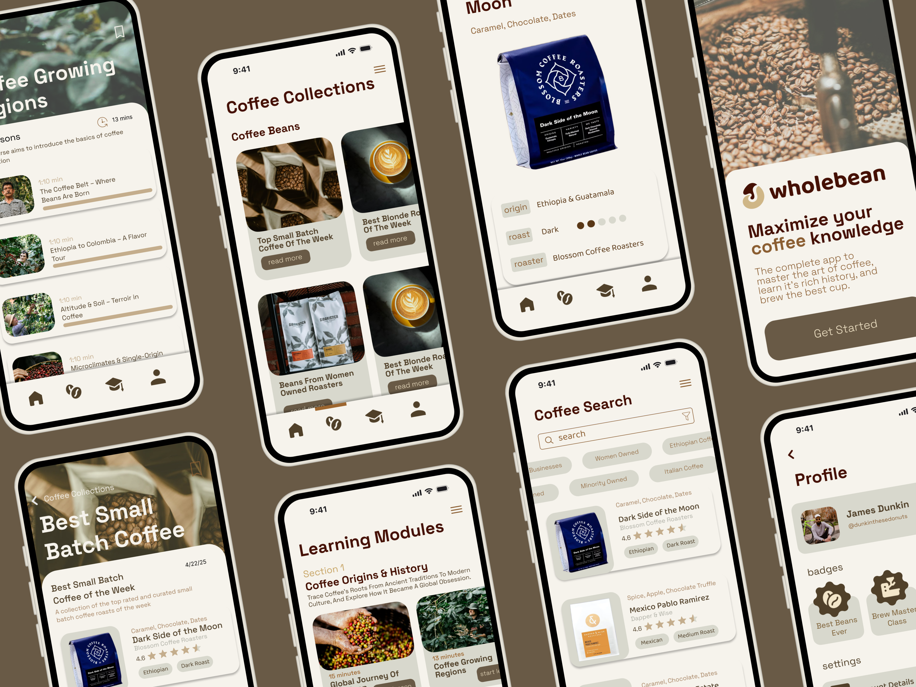
Coffee education, discovery, and conscious buying in one app.
Overview
Wholebean is built for people who want to know more about what is in their cup and use that knowledge to buy better.
It does two jobs at once. It surfaces blends and roasters you would not have found on your own, and it teaches you where those beans come from and how to get the most out of them.
The audience is anyone who likes coffee: baristas, shop owners, at-home craftsmen, everyday enthusiasts. Conscious consumption is the thread running through it. Know more, decide better.
The problem
The hard part was making an app that feels genuinely educational. Not a shop with articles bolted on, and not a textbook with a checkout button.
The audience is niche, and it is unforgiving. Baristas and roasters can tell immediately when depth is decorative.
- Education has to feel intentional. Content needs to earn its place instead of padding out a storefront.
- Discovery and learning share one surface. Two disconnected experiences would undercut the whole premise.
- Sourcing has to be legible. Conscious buying only works if origin information is easy to find and easy to read.
Process
Building Wholebean was a negotiation between decisions that make an app people return to and features a niche audience would actually use.
Designing and building at once
I was both the designer and the developer, so every feature I wanted to design I also had to build. That changed how I worked. Ideas got weighed against build cost from the moment I had them, which killed a lot of them early and made the survivors stronger.
Curating the feature set
What shipped is a deliberately small set of features rather than an accumulated one. I picked on two criteria: what I could finish in the time I had, and what was tight enough to show.
Being both designer and developer meant every idea had a cost attached the moment I had it.
Final product
Scroll the strip, or select any screen to open it full size.
Challenges
- Usable versus niche. Broadly good design decisions and features aimed at serious coffee people kept pointing in different directions. Most of the work was reconciling the two.
- Wearing both hats. No handoff, but no buffer either. Every interaction I specified was one I then had to make work.
- Scoping to the timeframe. Choosing what to cut was harder than choosing what to build. The deciding question was whether a feature could reach a showable standard.
Outcome
Wholebean ended up as a small set of finished features rather than a broad set of rough ones: a discovery flow, real sourcing detail, and education that lives inside browsing instead of beside it.
What it taught me was how differently you scope when you are also the one building. Feature selection stopped being a wish list and became a design constraint.
What I'd explore next
- Brew logging, so the education connects to your own results over time.
- Deeper roaster profiles, which would give the sourcing theme more to work with.
- Testing the learning content with working baristas to see whether the depth lands.