Craigslist Redesign
A ground-up mobile redesign that fixes what works against Craigslist's own values, without turning it into something else.
A modern marketplace that still feels like Craigslist.
Overview
Craigslist was founded on "restoring the human voice to the internet, in a humane, noncommercial environment." The app has not kept pace with that in years.
The goal was never to reinvent it. It was to fix the parts that work against the platform's own stated values, safety and usability and trust, while keeping the community-first, no-frills spirit intact.
Primary users
Older users who want a simple way to buy and sell. They need to list and search without friction, not a feature-heavy marketplace app.
Secondary users
People advertising services, posting jobs, or sharing resumes.
The problem
I audited the existing app before designing anything, screenshotting and walking real flows: posting an item, browsing categories, messaging a seller.
The failures grouped into five categories.
- Content. Almost no regulation on quality or safety. Spam and repeat listings everywhere, descriptions that describe nothing, and no filtering to catch unsafe posts.
- Organisation. Users land in an uncategorised, endless list. The gallery, list, and map views are cluttered and show little more than an image. Navigation was consistently the biggest issue.
- Usability. The app pushes the work onto the user. Sellers get a bare text box for titles and descriptions. Buyers get an in-app chat so thin that most real conversation happens over email.
- Technical. Dated and rarely updated. Pages load slowly, listing images go missing, and some buttons need several taps to register.
- Visual design. No consistent branding, type, colour, or layout. The interface is stripped back to stay approachable for less tech-savvy users, but it reads as dated instead, which works against that same audience.
I also mapped the existing flow by hand. The biggest gap showed up immediately: the app drops you out entirely to finish a transaction. Buyer and seller end up in email or text with a stranger, where there is no accountability and no record.
Make it secure and easy to use, without making it complicated.
Process
Every decision traces back to a specific pain point from the audit.
- Built for trust. Real profiles, ratings and reviews, and in-app chat with support, so the transaction can finish inside the app instead of in a stranger's inbox.
- Modern without complicated. Consistent colour, type, and layout, but the same low-friction navigation that made Craigslist approachable in the first place.
- A flow that holds. Categories surface on the home screen as tappable options rather than buried in a list, with fixed bottom navigation so you are always one tap from getting back on track.
What changed
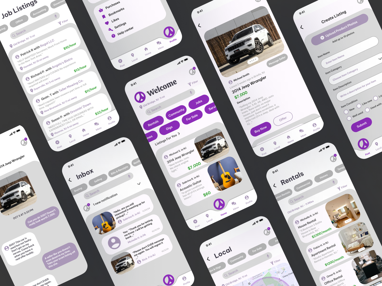
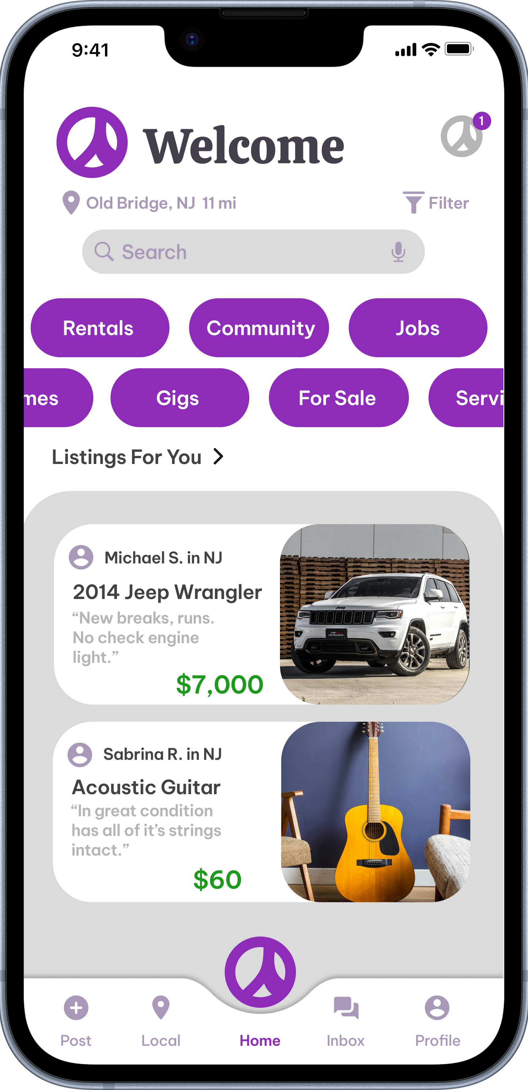
- Home. Location, search, and category pills for every offering, followed by a "Listings For You" feed. Scannable at a glance instead of an undifferentiated wall.
- Listing details. Full-bleed photo, price, description, and seller info up front, with clear Buy Now, Offer, and Message Seller actions.
- Create Listing. A guided flow replaces the blank text box. Photo upload, item name, category, description, and condition as separate fields.
- Inbox. Split into Buying, Selling, and Bills & Receipts, turning an unusable chat into a real communication system.
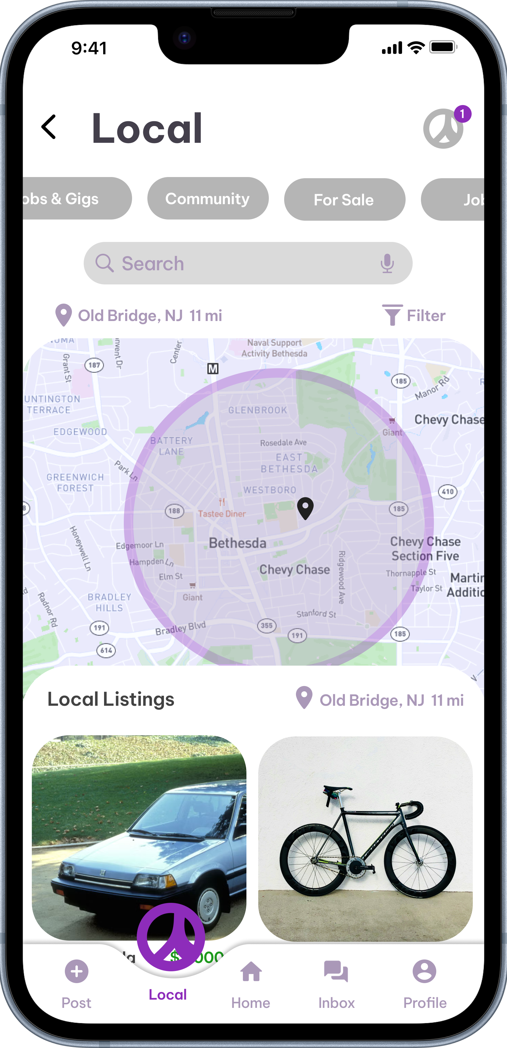
- Local & Rentals. Category-specific browsing with filtering and search built in.
Visual identity
A soft purple gradient and clean white cards replace the old visual language, paired with a peace-sign app icon. It is a quiet nod to that original mission, carried into something that actually looks current.
Final product
Scroll the strip, or select any screen to open it full size.
Challenges
- Modernising without alienating. The core users are older and specifically value simplicity. Every upgrade had to be weighed against the risk of feeling more complicated rather than more trustworthy.
- Safety without friction. Profiles, reviews, and authentication all add onboarding steps. The trick was adding real protection without recreating the "too much work" complaint.
- Keeping it recognisable. It needed to still feel like Craigslist, just one that finally works.
Outcome
The redesign closes the loop the original leaves open. You can discover, evaluate, message, and transact without ever being pushed out to email.
What I took from it is how much of a redesign is restraint. The easy version is a polished generic marketplace. The useful version keeps the platform's values and only changes what demonstrably fails them, which meant auditing first and designing second.
What I'd explore next
- Usability testing with older users, since every simplicity assumption here deserves checking against the real audience.
- A moderation and reporting flow, which is the other half of the safety problem.
- An accessibility pass on type scale and touch targets.