Recipe App
A chef-forward cooking platform where the photography leads without burying the instructions underneath it.
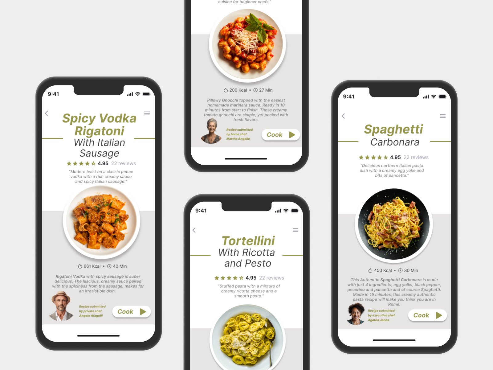
A cookbook that still works when your hands are covered in flour.
Overview
One of my earliest app projects, built around a chef-forward cooking platform where food photography sits at the centre instead of being an afterthought.
Community chefs share dishes with descriptions, nutritional info, and step-by-step instructions. The point was making home cooking feel accessible rather than intimidating.
It was design only, fully prototyped in Figma. It also taught me more about the tension between usability and aesthetics than anything I had made before it.
The problem
Most recipe apps fail in one of two opposite directions.
- Too aesthetic. Beautiful photography and editorial layouts, with the actual instructions buried under scrolling.
- Too functional. List-based, forgettable, no craft and no appetite appeal at all.
I wanted one that did not have to choose. Food that looks as good as a magazine, and a recipe someone can follow with flour on their hands.
A cookbook is not built for someone who is actively cooking. The app had to be both.
Process
Four decisions carried the design, each one a trade between how good the food looks and how fast you can act on it.
- Photography is the entry point. Every recipe leads with a large image, because people decide what to cook from what looks good before they read an ingredient.
- Richness balanced against scannability. Ingredients, nutrition, steps, and chef notes are a lot for one screen. Clear hierarchy and progressive disclosure show what you need at each stage instead of everything at once.
- Built for the kitchen, not just the browse. Once you commit to a recipe the experience shifts. Steps break into chunks meant to be glanced at, not read start to finish.
- A community-chef model. Chefs post their own dishes, so the system had to feel personal from chef to chef while staying visually consistent.
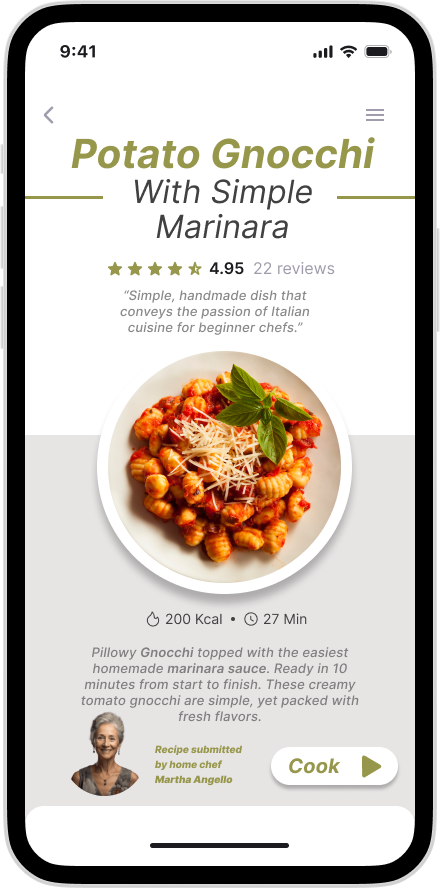
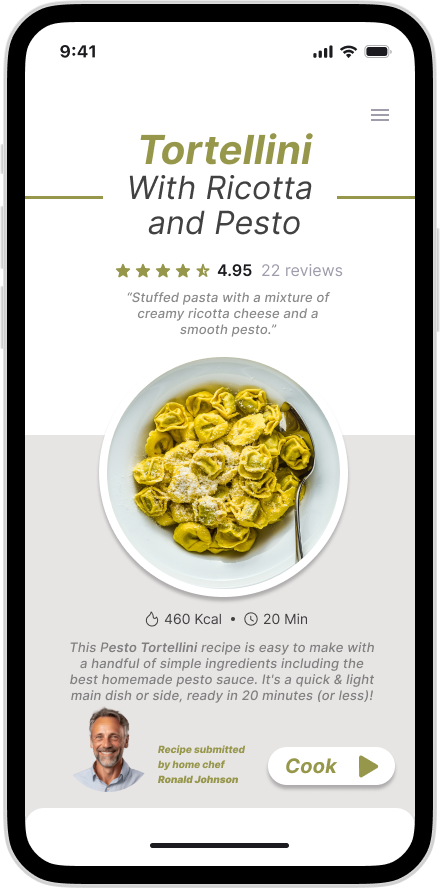
Final product
Scroll the strip, or select any screen to open it full size.
Challenges
This was my first real lesson that beautiful and usable do not automatically go together. They pull against each other, and the design is the negotiation.
- Photography versus density. Large appetising imagery is the concept, but it competes directly with the space ingredients and steps need.
- Editorial feel versus clarity. I wanted it to feel like a beautifully shot cookbook, but a cookbook is not built for someone with wet hands and fifteen seconds of attention. Reconciling browsing and doing shaped most of the hard calls.
- Consistency across many chefs. Letting each chef feel distinct without the interface turning chaotic was a harder systems problem than I expected.
Outcome
A fully prototyped app with two modes inside one visual language: editorial browsing, and a stripped-back cooking mode that takes over once you commit to a dish.
This is the project where I stopped treating beautiful and usable as the same goal. Splitting the experience by what the user is actually doing, deciding versus cooking, is what resolved it. I have used that approach on every product since.
What I'd explore next
- A hands-free cooking mode with voice or timer-driven steps, which is where the kitchen-first thinking leads.
- Chef profile theming, to give the community model more range without breaking consistency.
- Testing the disclosure with real cooks mid-recipe rather than judging it from the artboard.