Furtrieve
My first real creative team. Weekly social campaigns, twenty user personas, and nine App Store screens for a pet-tech company building four products at once.
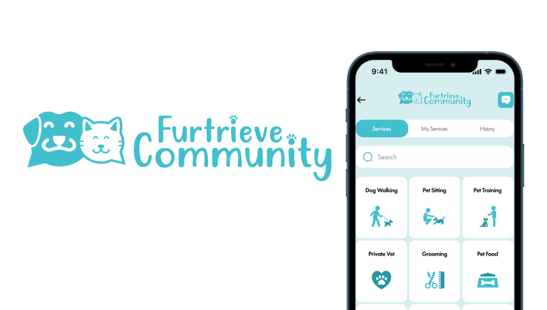
Pet tracking, community, and health across one brand system.
Overview
Furtrieve was my first real step into a creative team, where we met regularly and actually argued through the decisions behind marketing a niche set of products.
My job was a weekly social advertisement, static or motion, built inside the company's brand guidelines and aimed at pet owners shopping for an alternative tracking device or a new social platform for their pets.
Four products, one brand
- Furtrieve. The existing product, a dog collar with tracking.
- Purrtrieve. The same idea built for cats.
- Furtrieve Community. An upcoming social space for pet owners.
- Furtrieve Health. An ambitious upcoming app for managing a pet's health.
The challenge
The ambition outran the headcount. A small team of rotating interns and a handful of full-timers was carrying four products at different stages of existence.
That gap set the terms. The design problem was not producing one polished thing. It was making consistent brand decisions fast, over and over, for products that each spoke to a different person.
- A weekly deadline. Something shipped every week regardless of which product was in focus.
- Four audiences, one identity. A cat owner, a dog owner, a prospective social user, and a pet-health user are not the same person.
- Guidelines to work inside. Every piece had to read as Furtrieve first and as a campaign second.
Process
Weekly content as an exercise
The work rotated across products constantly, and the weekly turnaround turned out to be good training. It forced me to commit to a direction quickly and then defend it, instead of circling a concept for days.
Twenty user personas
The first of two larger projects. I built around twenty personas for the upcoming Community product, each with its own needs and motivations. It sharpened my UX thinking more than anything else that summer, moving me from "pet owners" as one audience to twenty specific people with different reasons to show up.
Nine App Store screens
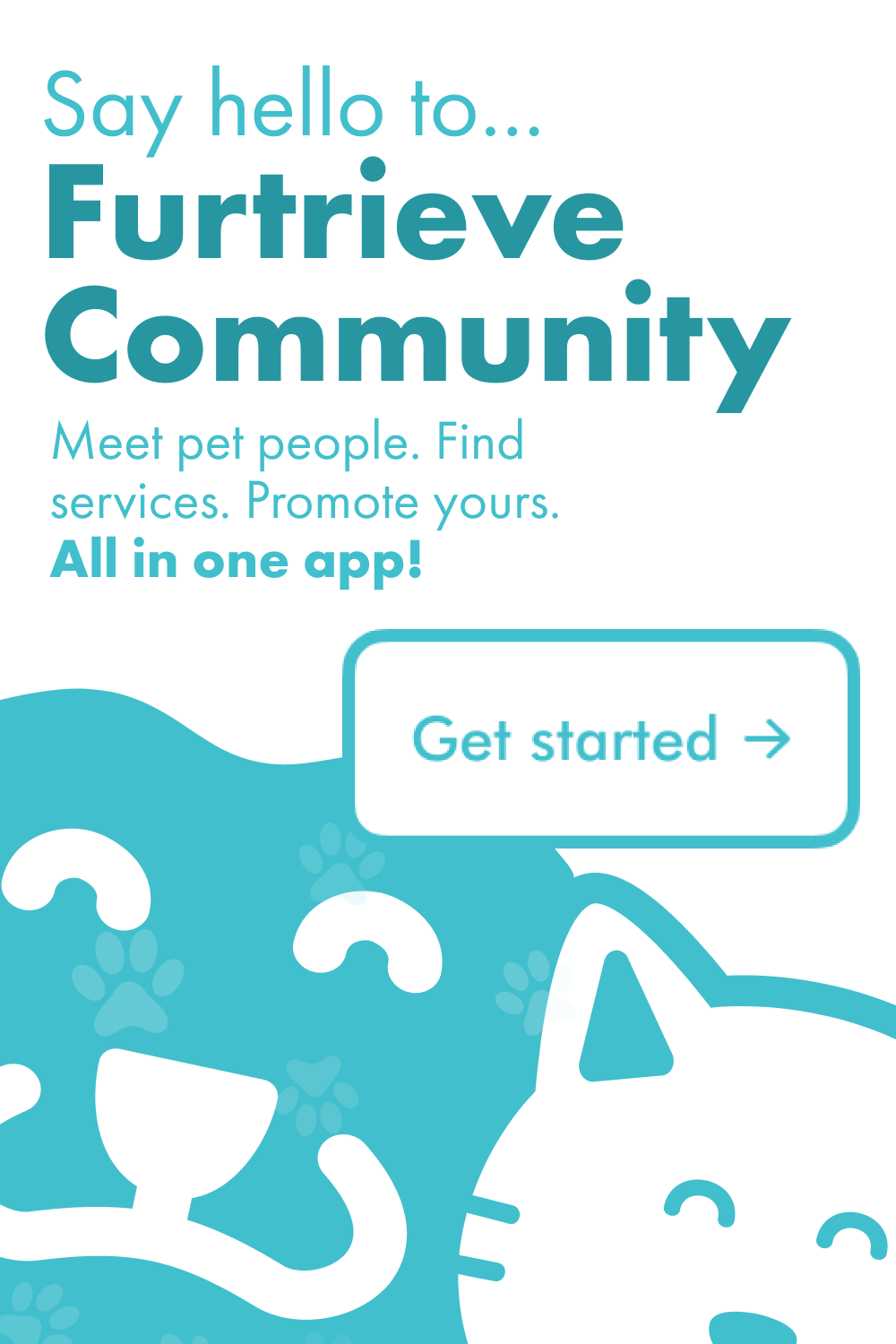
The important one. Nine screens that would run in the App Store at launch, reviewed and picked apart over several weeks until everyone signed off.
It was humbling, and it taught me what curation actually costs. Finished work takes far more rebuilding than I had assumed.
Several weeks of review on nine screens taught me more about curation than any single design decision did.
Final product
App Store screens
The nine screens, after several rounds of review.
Social campaigns
A selection of the weekly placements across the product line.
Challenges
- Deciding fast, every week. A weekly deadline leaves no room to sit on a concept. Learning to make a call quickly and stand behind it in a room was the most useful habit I built.
- Ambition against capacity. Four products and a rotating intern team meant the work was always broader than the resourcing, so prioritising became part of the job.
- Surviving real review. Watching the App Store screens get rebuilt repeatedly before anyone called them finished reset my sense of what "done" means.
Outcome
A weekly campaign shipped on cadence all summer, roughly twenty personas for the Community product, and a finished set of nine App Store screens signed off by the team.
What stayed with me was less any single deliverable and more how design survives a real organisation. How fast you have to decide, how much rebuilding a finished product takes, and how differently you brief yourself after writing twenty personas instead of imagining one user.
What I'd explore next
- Connecting the personas to the campaign work, so content could target a persona rather than a product.
- A small motion template system, which would have cut turnaround on the animated placements.
- Tracking performance per placement, so the decisions had evidence behind them instead of consensus.