Thread Bank
A conceptual nonprofit clothing donation platform built on one idea: a thrift store should not lose sight of the people it exists to serve.
Community-run, transparent, built around fair treatment.
Overview
Thread Bank is a nonprofit clothing donation platform I built from the ground up: concept, business case, brand identity, app prototype, and an animated logo.
I invented the organisation before touching a logo. I researched how thrift-store nonprofits actually operate and where they fall short, then built the identity as a direct answer to what I found.
The problem
Name-brand thrift stores talk about accessibility and inclusivity. The record often says otherwise.
- Corporate greed erodes the mission. Stores built to provide necessities to people who cannot get them elsewhere drift toward price gouging and profit-driven decisions.
- Opportunity programmes do not hold up. Organisations advertising jobs for disabled, veteran, and immigrant workers have been documented paying some of those employees as little as 22 cents an hour.
- Inclusivity claims do not match track records. Goodwill, a nonprofit with over 4,000 locations, has faced lawsuits spanning race, sex, disability, and sexual orientation discrimination.
A community-run organisation could actually deliver on the promises the big players make and break.
Competitive analysis
| Organisation | Scale | Key issue |
|---|---|---|
| Goodwill | 105,000+ employees, $7.4B/year | Discrimination lawsuits across race, sex, disability, and sexual orientation. Documented underpayment of disabled workers. |
| Salvation Army | 172,000+ employees, ~$45M/year | Religious-affiliation-driven discrimination, including anti-LGBTQ+ positions and employee firings. |
| Savers | 20,000+ employees, $1.4B/year (for-profit) | Misled the public on payments to nonprofit partners. Settled for $300,000 per partnering charity. |
The pattern was consistent. Every major player had a gap between its public mission and its practice. Thread Bank was designed to close it.
Process
I built the full identity and documented it in a formal brand guideline, so it could scale across app, print, and motion without drifting.
Logomark
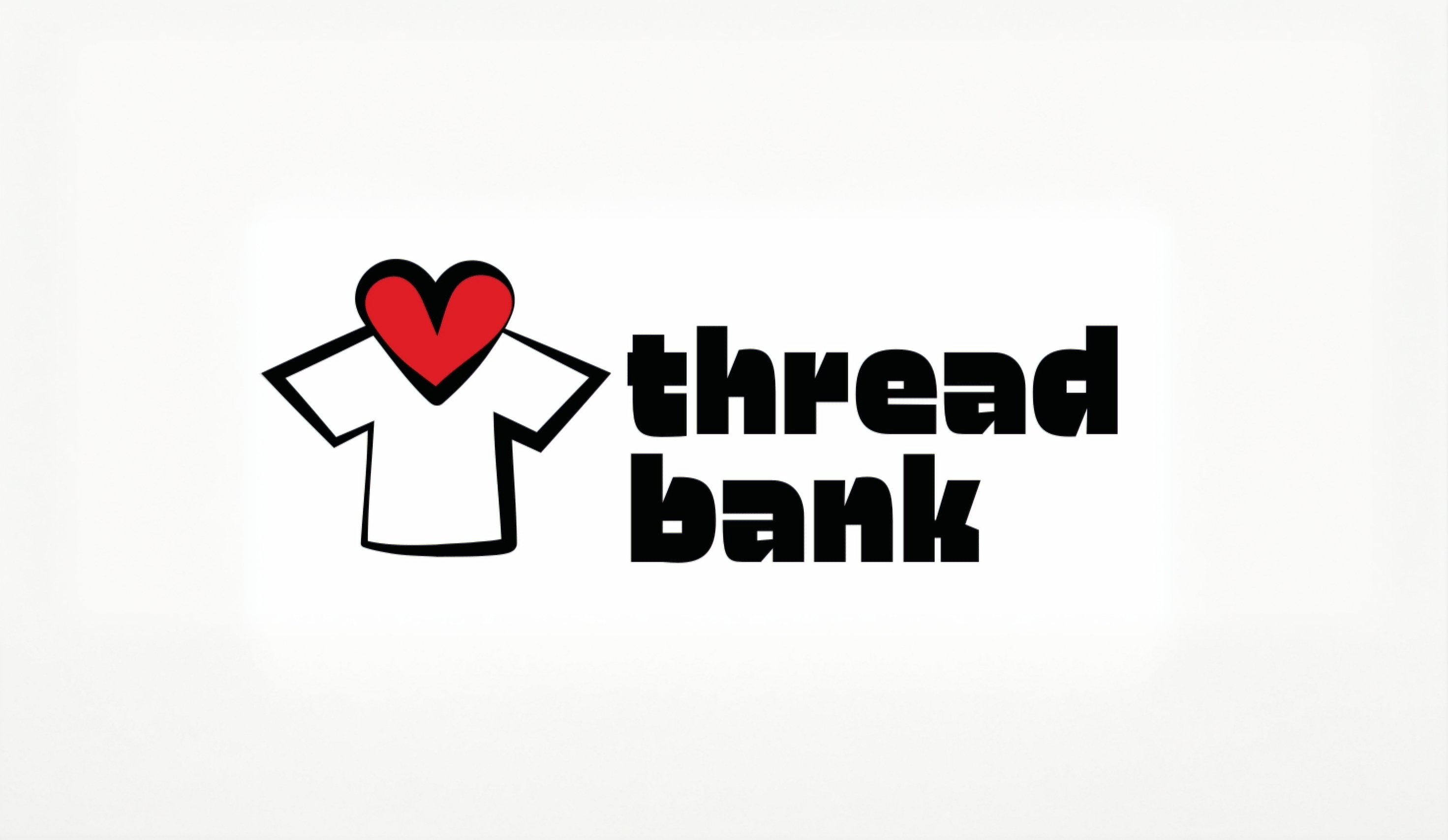
A stylised shirt paired with a heart, standing for the values the organisation is built on: diversity, community, and care for people who get overlooked. The system includes text and icon-only variants, with strict rules on proportional scaling and a 7pt base stroke that scales with the mark so it holds at any size.
Colour
A bold red with black and white, chosen to feel urgent and human rather than corporate. Yellow, pink, and purple are held back for specific promotional use so the core expression stays focused.
Typography and usage
Three tiers: a heavy display face for the logotype, a distinct face for section headers across stationery and web, and Alternate Gothic No3 D for body copy. The guideline also spells out what not to do, from resizing the logomark to substituting fonts, so the identity survives being handed to another designer.
App prototype
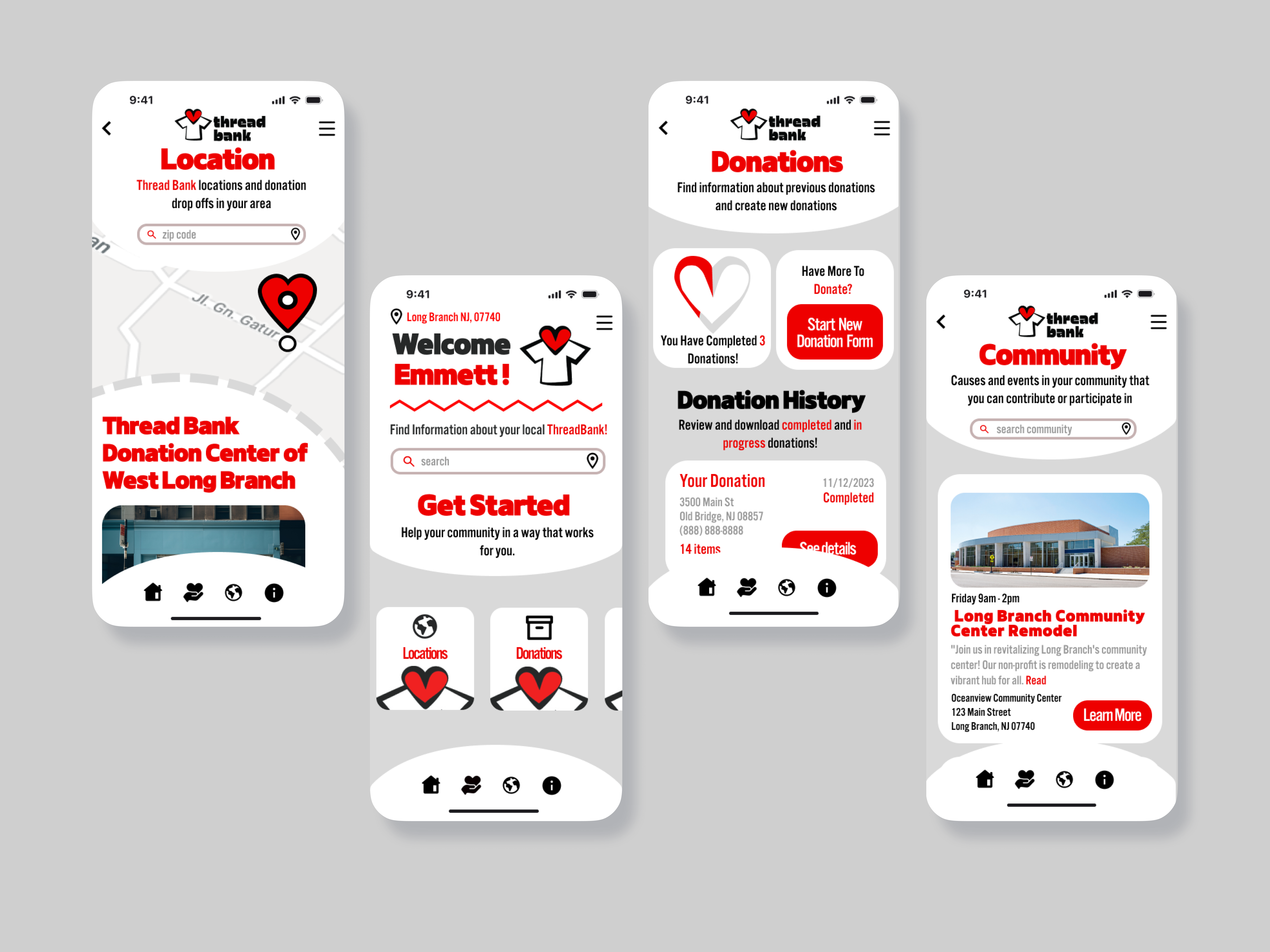
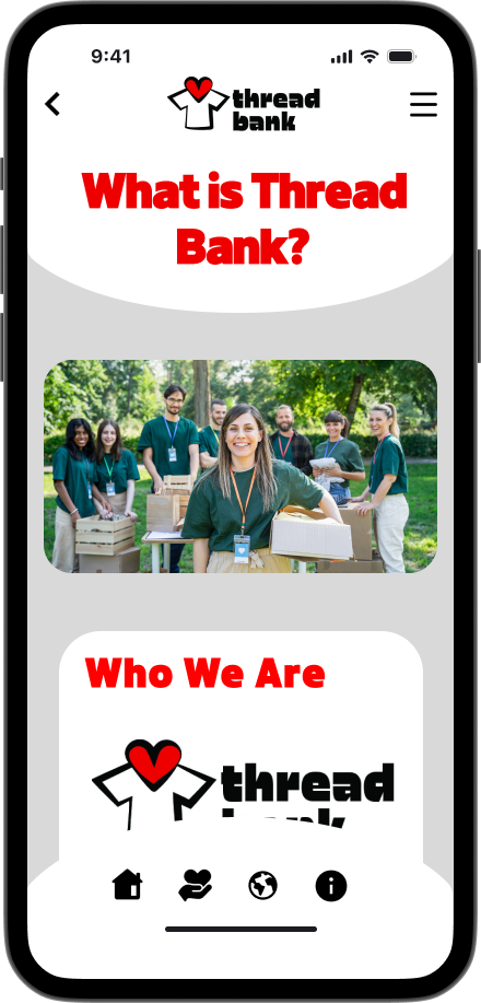
The app makes taking part as frictionless as the brand promises. It connects donors to nearby drop-off points, tracks donation history, and surfaces community events, turning "donate to Thread Bank" into a tap rather than a special trip.
Red does the work here. It marks the primary action on every screen rather than decorating, so the path forward is the thing the brand is pointing at.
Animated logo
A short animated logo closes the system out, built to explain Thread Bank in the few seconds a social feed gives you. It uses the construction of the mark itself as the spine of the animation, so the brand does the storytelling instead of sitting on top of it.
Final product
Scroll the strip, or select any screen to open it full size.
Challenges
- Bold enough to stand for something. The whole premise is a critique of how bigger organisations operate, so the brand could not play it safe. It had to feel urgent without tipping into unprofessional.
- One identity, very different formats. The same system had to hold up as a small app icon, a printed guideline, and motion.
- Research before assumption. Building the business case first, with competitor practices and wage and legal history, meant the direction had real justification rather than taste behind it.
Outcome
A complete system rather than a logo: a researched business case, a documented guideline, an app prototype, and an animated logo, all built on the same argument.
The sequencing is what changed how I work. Researching wage data and legal history before opening a design file gave the identity a position to express. Every later decision, including the urgency of the red and the refusal to soften the tone, could be defended against that position instead of against taste.
What I'd explore next
- The consignment and selling side, which the current screens do not cover.
- In-store and print applications, to pressure-test the guideline off screen.
- A transparency view reporting wages and where money goes, since that is the whole differentiator.